Design Trends
AX-Driven Design: Where UX Meets Performance
Apr 5, 2025
Too Long; Designed Right (TL;DR):
Agent Experience (AX) is the secret to effective service operations.
Effective UX writing minimizes confusion and increases productivity.
Color decisions enhance clarity and inform decision-making for AX dashboards.
Indicators such as Clicks to Completion reveal workflow bottlenecks.
Smooth integrations avoid tool fatigue and minimize friction.
In the always-on, digital-first world of today, customers demand instant support. But behind every quick fix is a customer support agent switching tabs, toggling tools, and dealing with complicated workflows. When their tools are badly designed, the agent suffers—leading to slower service, mistakes, and frustration.
That's where Agent Experience (AX) comes in as a game-changer.
What is AX?
AX (Agent Experience) means how simple, effective, and intuitive it is for service agents to engage with internal systems such as CRMs, helpdesks, ticketing systems, and knowledge bases. In contrast to the usual UX (User Experience), which is customer-centric, AX is centered on the individuals behind the screen—your support, sales, and operations staff.
Image Source: Resend.com
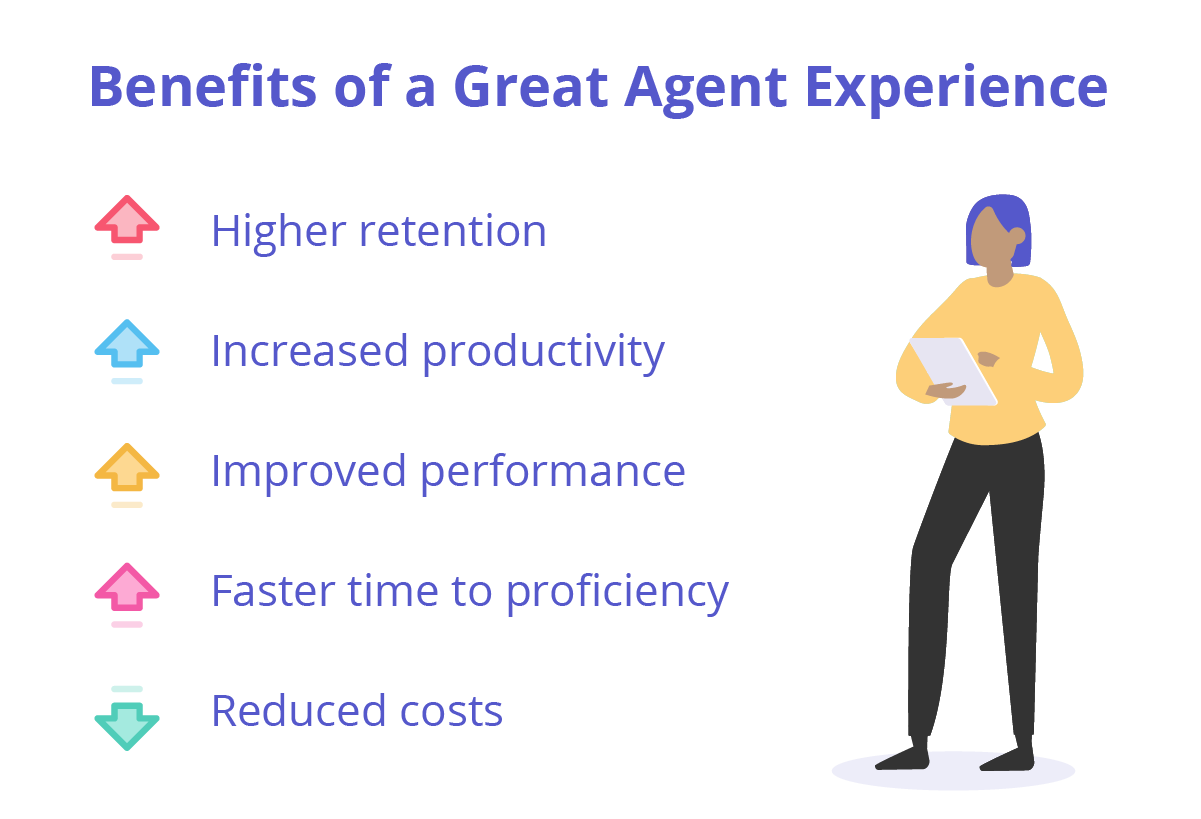
Better AX doesn’t just improve morale; it improves metrics like ticket resolution time, customer satisfaction, and agent retention. Let's break down how smart UX design can transform AX into a true productivity engine.
1. Empowering Agents with Clear UX Writing
Let’s start with something small that has a massive impact: words.
When an agent looks at a button with the words "Deploy Resolution Protocol," they pause. What is that? Do I click it? What will happen?
Now think of the button reading "Send Response." Simple, direct, and assertive.
That's the power of UX writing.
What is UX Writing?
UX writing is the process of writing the microcopy—brief pieces of text such as button text, tooltips, error messages, and field labels—that move users through a digital product. It's not about using big words. It's about being helpful.
Microcopy = small pieces of helpful text that guide users. Think "Submit," "Try again," or "Select a file."
For agents, this clarity is essential. They're already juggling difficult conversations and resolving intricate issues. The last thing they need is ambiguous labels or unclear messages.
Why It Matters for AX?
In Agent Experience, time and mental capacity are valuable. Each second saved translates to hundreds of tickets a day.
Real-World Example: Zendesk's Agent Dashboard
Zendesk's agent UI is full of examples of fantastic UX writing. Agents get to see things such as "Assign," "Reply," or "Mark as Solved." The verbs are not vague and capture what the agent is really trying to accomplish. New employees are able to become familiar more quickly just by glancing at the interface.
Image Source: Procedureflow.com
Another Example: Google's Admin Console
In Google Workspace, admin actions like “Reset Password” or “Suspend User” are clear and leave no room for misinterpretation—critical in high-stakes environments.
Writing Tips for Better AX:
Use plain language: Instead of “Escalate Request,” say “Forward to Supervisor.”
Be action-first: Buttons should say what happens next.
Avoid jargon: If it wouldn’t be in a natural conversation, rethink it.
Write useful placeholders: A search box that reads "Search past tickets" is more helpful than "Search."
Pro Tip: Test with live agents
They should not hesitate when reading or look uncertain. Your microcopy requires improvement if they do. In AX, clarity = speed.
Excellent UX writing in AX instills confidence. And confident agents are better at serving customers.
2. Leverage Color Psychology to Inform Agent Decisions
Consider how instinctively your eyes respond to color: red = stop, green = go, yellow = wait. In the high-stakes environment of Agent Experience, color is not ornamentation—color is guidance.
Why Color Works in AX?
Support agents handle dozens of tickets, chats, and notifications per hour. An effective AX dashboard leverages color to:
Emphasize what requires attention
Indicate ticket status
Save scanning time
Avoid mistakes
But the catch is consistency and moderation.
Know more about AI tools for generating colors here.
Universal Color Conventions in AX:
???? Red = Urgent
Red notifies agents of missed tickets, breaches, or failures.
Example: Salesforce displays a red banner when a ticket has exceeded its SLA (Service Level Agreement).
???? Blue = Neutral or Resolved
Blue implies serenity and completion.
Example: Intercom marks closed conversations in blue, indicating finality.
???? Yellow = Pending or Needs Action
Yellow alerts without alarm.
Example: Freshdesk displays "Waiting on Customer" tickets in yellow.
???? Purple or Gold = Premium or Special
Used to highlight VIP customers or sensitive cases.
Example: HubSpot marks high-value clients as gold, which aids in prioritizing service.
Real-World Scenario: Call Center Dashboard
An AX dashboard of a telecom company was revamped to display:
Red tiles for "Tickets overdue by 24+ hours"
Yellow tiles for "Waiting on customer"
Green tiles for "Resolved today"
The revamp resulted in a 30% reduction in missed SLAs, just by allowing agents to see priorities quicker.
AX Color Design Tips:
Use color + icon + text for accessibility.
Never trust color alone—use clear labels.
Don't use too many colors. Over 4 can be overwhelming.
Colorblind testing with contrast checkers.
Color is a silent guide on the agent's path. Used correctly, it eliminates decision fatigue and accelerates response time.
3. Measuring the Right Metrics for AX Improvement
Designing for AX isn't a one-time job—it's continuous optimization. In order to get better, you have to measure the right stuff.
Most teams monitor customer-facing metrics such as:
CSAT (Customer Satisfaction)
NPS (Net Promoter Score)
These are good—but they don't capture what's going on behind the scenes. That's why AX metrics are important.
Important AX Metrics You Should Be Monitoring
✅ Clicks to Completion
How many clicks does it take an agent to get something done?
High clicks = friction.
Low clicks = effective design.
Example: A finance team cut "Loan Approval" clicks from 9 to 3 by simplifying their AX interface.
???? Navigation Loops
How many times do agents change tabs or go back and forth between pages to finish one task?
More loops = bad flow.
Best goal: all required info on one page.
???? Dead Ends
These are instances where the system prevents the agent's progress.
May be a missing field, broken API, or confusing error message.
Real-Life Solution: Shopify's team saw agents getting stuck on refund processing because of absent item details. Adding inline information and autofill capabilities reduced refund errors by 40%.
Additional Useful Metrics:
Time on Task: How much time does an action take?
Error Rate: How frequently do agents fill out incorrect forms or have to rework?
Tool Switches Per Task: How many tools per interaction?
Tools to Track:
Hotjar or FullStory for session replays.
Agent surveys asking questions such as "What held you back today?"
Backend logs indicating form errors or abandoned tickets.
AX metrics reveal hidden roadblocks. When you resolve them, everyone benefits—agents and customers alike.
Image Source: Valuemomentum.com

4. Seamless Integrations: The Heart of Modern AX
Agents today seldom work within just one tool. A typical support agent balances:
Helpdesk (such as Zendesk)
CRM (such as Salesforce)
Chat platforms (such as Intercom)
Knowledge base
Internal tools
If these tools aren't "talking" to one another, you have chaos: copy-pasting information, toggling tabs, entering passwords again, and losing customer context. That's bad AX.
What Does Seamless Integration Mean?
Seamless integration means that tools work in harmony like one system:
Data flows seamlessly.
Agents don't have to toggle tabs.
Context is preserved across screens.
Features That Enhance Agent Experience:
???? Single Sign-On (SSO)
Log in once, access everything.
???? Contextual Panels
Display relevant info (such as customer history) in a sidebar.
???? Auto-Syncing Status
Mark a ticket closed in one tool, it's closed across.
Actual Example: Aircall + HubSpot
At call initiation, Aircall opens a HubSpot panel with the customer's full history—no searching or tab switching required. This saved agents 5 minutes per call.
???? Pre-filled Forms
Fill forms with existing customer data. Fewer errors. Quicker input.
???? Progressive Disclosure
Reveal the most critical information first. Have agents drill down for more.
Example: In Intercom, one click on "More Details" opens up extra customer notes without exiting the conversation view.
Image Source: eGain.com

Effect of Superb Integrations:
Less mental strain
Fewer mistakes
More satisfied agents
Quicker support
Superb AX is not about introducing more functionality—it's about bringing the appropriate ones together.
Conclusion: Designing for the Agent = Designing for Success
Support agents are the unsung heroes of customer experience. But they're often using clunky, antiquated systems. By prioritizing Agent Experience (AX), businesses can realize new heights of efficiency, satisfaction, and performance.
Let's review how to design AX that works:
Use clear, useful UX writing
Use color psychology to direct action
Monitor internal AX metrics, not only CSAT
Combine tools to build smooth flows
Real Impact: Zappos, Amazon, and Shopify invest heavily in internal agent tools. Why? Because
Better AX = faster support + happier customers.
Read next: Best AI User Interface Design Tools for UI/UX Designers in 2025